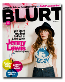
Rankin
information
sited from- http://rankin.co.uk/biography/
Rankin made his name in publishing, founding the seminal monthly magazine Dazed & Confused with Jefferson Hack in 1992. It provided a platform for innovation for emerging stylists, designers, photographers and writers. The magazine went on to forge a distinctive mark in the arts and publishing spheres, and developed a cult status forming and moulding trends, and bringing some of the brightest lights in fashion to the foreground.
Rankin has created landmark editorial and advertising campaigns. His body of work features some of the most celebrated publications, biggest brands and pioneering charities, including Nike, Swatch, Dove, Pantene, Diageo, Women’s Aid, and Breakthrough Breast Cancer. He has shot covers for Elle, German Vogue, Harpers Bazaar, Esquire, GQ, Rolling Stone and Wonderland. His work has always endeavoured to question social norms and ideas of beauty and, in late 2000, Rankin published the heteroclite quarterly Rank, an experimental anti-fashion magazine celebrating the unconventional. In 2001, Jefferson and Rankin launched AnOther Magazine. With a focus on fashion, originality, and distinction. In response to the expanding menswear market, in 2005 AnOther Man was introduced, combining intelligent editorial with groundbreaking design and style. More recently, the Dazed Group has established itself as an online authority, via AnOthermag.com, Dazeddigital.com and Dazedtv.com. Rankin celebrated Dazed & Confused’s 20th anniversary, shooting 20 front covers of Dazed favourites and 20 inside covers of the next generation of talent, for the December 2011 issue.
Tapping into the consciousness of the 90s and 00s with his intimate approach and playful sense of humour, Rankin became known for his portraiture of bands, artists, supermodels and politicians. Having photographed everyone from the Queen of England to the Queen of Pop, Rankin is often seen as a celebrity photographer. However, his plethora of campaigns and projects featuring ‘real women’ marked him out as a genuinely passionate portrait photographer, no matter who the subject. Always pursuing personal projects which push his limits, high impact charity projects, and groundbreaking commercial campaigns, Rankin has stood out for his creative fearlessness. His first major worldwide and award-winning campaign, Dove’s ‘Real Women’, epitomised his approach: to reveal the honesty of the connection and collaborative process between photographer and subject. Personal or commercial, Rankin’s images have become part of contemporary iconography, evidence of his frankness and passion for all aspects of modern culture, and its representation in the photographed image. Rankin has published over 30 books, is regularly exhibited in galleries around the world, as well as his own London gallery. His museum-scale exhibition ‘Show Off’ opened at NRW Dusseldorf in September 2012, pulling in over 30,000 visitors in 3 months.
In the last few years, he has frequently turned his hand to studies of photography through TV presenting. Working with the BBC, he has featured in a number of seminal documentaries, ‘The Seven Photographs that Changed Fashion’, ‘South Africa in Pictures’, ‘Shooting the Stars’, ‘The Life Magazine Photographers’ and most recently, an in-depth documentary into the modern approach to death in, ‘Alive: In the Face of Death’.
His affiliation with charities has seen Rankin travel the world, creating powerful campaigns both as a photographer and a director. With Oxfam, he visited the Democratic Republic of the Congo and Kenya, and in 2011 hosted an Oxglam exhibition, featuring work from some of the world’s most talented emerging young photographers, and raising money for the charity. 2013 sees a planned trip to Jordan and Lebanon with Oxfam. In 2009, Rankin undertook the biggest project of his career, Rankin Live, a mammoth, interactive spectacle and exhibition. Always interested in the democratisation of the image, and also a keen advocate of the amazing digital advances of the photographic industry, Rankin Live was the culmination of the accessibility and speed of modern photography. Rankin proved that everyone can look like a magazine cover star as, for 7 straight weeks, he photographed people off the street, one every 15 minutes, retouching, printing and hanging the image within half an hour of the shutter being fired. Rankin photographed over 1600 Londoners, before then taking Rankin Live on tour in Mexico and New York.
His affiliation with charities has seen Rankin travel the world, creating powerful campaigns both as a photographer and a director. With Oxfam, he visited the Democratic Republic of the Congo and Kenya, and in 2011 hosted an Oxglam exhibition, featuring work from some of the world’s most talented emerging young photographers, and raising money for the charity. 2013 sees a planned trip to Jordan and Lebanon with Oxfam. In 2009, Rankin undertook the biggest project of his career, Rankin Live, a mammoth, interactive spectacle and exhibition. Always interested in the democratisation of the image, and also a keen advocate of the amazing digital advances of the photographic industry, Rankin Live was the culmination of the accessibility and speed of modern photography. Rankin proved that everyone can look like a magazine cover star as, for 7 straight weeks, he photographed people off the street, one every 15 minutes, retouching, printing and hanging the image within half an hour of the shutter being fired. Rankin photographed over 1600 Londoners, before then taking Rankin Live on tour in Mexico and New York.
In 2011, Rankin Film Productions was born. Rankin developed a taste for film
directing music videos, commercials, and short films with co-director Chris Cottam between 2002 and 2009, including their debut feature film, The Lives of Saints. Written by Toni Grisoni (Fear and Loathing in Las Vegas), it won the grand jury prize at the Salento International Film Festival. Since 2009, Rankin has continued to direct independently on both commercial and personal projects. Taking on the new role of Executive Producer, Rankin recently founded Collabor8te, in association with The Bureau and Dazed TV. Collabor8te calls on scriptwriters and directors to submit their ideas for narrative film, promising to turn a selection of these dreams into a reality, producing them, featuring them on Dazed TV, and running them on the international film festival circuit. In November 2011, Rankin returned to magazine publishing with a fresh offering, The Hunger. A biannual fashion, culture and lifestyle magazine, The Hunger and its associated Hunger TV website, a video-based digital platform featuring in-depth interviews, fashion films, blogs, updates, and previews, marked Rankin’s return to the fashion world with an understanding that the future is not only printed but digital too.
directing music videos, commercials, and short films with co-director Chris Cottam between 2002 and 2009, including their debut feature film, The Lives of Saints. Written by Toni Grisoni (Fear and Loathing in Las Vegas), it won the grand jury prize at the Salento International Film Festival. Since 2009, Rankin has continued to direct independently on both commercial and personal projects. Taking on the new role of Executive Producer, Rankin recently founded Collabor8te, in association with The Bureau and Dazed TV. Collabor8te calls on scriptwriters and directors to submit their ideas for narrative film, promising to turn a selection of these dreams into a reality, producing them, featuring them on Dazed TV, and running them on the international film festival circuit. In November 2011, Rankin returned to magazine publishing with a fresh offering, The Hunger. A biannual fashion, culture and lifestyle magazine, The Hunger and its associated Hunger TV website, a video-based digital platform featuring in-depth interviews, fashion films, blogs, updates, and previews, marked Rankin’s return to the fashion world with an understanding that the future is not only printed but digital too.


 I really like these photo of Rankin's I want to try something like this. I like the way this is in black and white is used and how the light reflects of the paint or what he has used. I am going to try and re-do these photos myself and see how it tuns out I am then I'm going to try experimenting with different things, to do with these photos.

My Attempts
I have tried to replicate this photo of rankins it doesn't exactly look the same but i still like the way it is in black and white and how the light reflects off the paint. These are also some photos of the process and the ones that didn't turn out you i wanted them too.
i tried to copy two of the images above here but none of them turned out how i wanted them too. Next time I need to make sure that the lights go off. I also need to make sure i get the right angles and stuff as the actual picture to get the same effect. i don't think i will be using things like this for my final images.


Paint Pictures
 Thinking about these pictures he has used light on a lot of them and reflected it. I think my idea for this area will be to use baby oil or something, apply it to my models face and let the light shine off it. I like these because they have turned out well the other ones where pictures i didn't like as much from the shoot.

 I have taken these three pictures with colour as well as black paint i really like them because i think it looks really effective. I like the way i have used the lighting and how the light shines off the paint. I really like the photo to the right because I have caught the drip dripping off his face where as I also like the photo to the bottom left because his head is at a really good angle and he looks really sassy. Where as I don't like the top left one as much because I think there is a bit to much coloured paint on him where as on the other two there isn't as much. I might use one of these as my final image but if I did I would crop it so the bin bag wasn't in it and edit them to make sure you can't see the shower cap. For all these photos I used a low key effect.


 I really like these photo i have used Rankins idea of using people but in these i have thought about it more i have thought about the stimulus which is reflections and thought about it i thought i could connect this to people not being who you think they are for example: a person seems lovely but on the inside they're plane evil. Thats how i came up with the idea of projection of the devil on the face of someone and of the shadow of someone. Then i thought about the timed people that nobody notices and that are lovely and projected a happy cat on their face.