Tuesday, 21 October 2014

Evaluation of Studio Photography

Dance
There are a lot of advantages and disadvantages to Dance photography in the studio. The advantages are you can create sets how you want the sets like then just relying on a place. Another is that you can make the photos more dramatic with the lighting and do things you wouldn't be able to do outside. Another advantage of doing it inside the studio is that the costumes/clothes won't get messed up etc. One more advantage is that there is no wind inside so it doesn't matter if it is a windy day you can still have the shoot. The disadvantages of doing shoots in the studio is that if you want the picture to have a natural effect on the photo then it can look quite fake. Another disadvantage of being in the studio is you only have a limited space to work with. One more disadvantage is that the backdrops aren't always smooth so you don't always get the effect you want.

Lighting
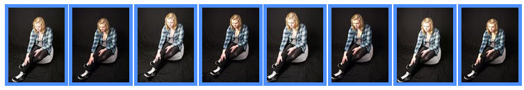
This is the set up I used for the picture I used two soft boxes quite close to the model on a black backdrop. I used the soft boxes to give the light a softer effect on my model rather then a really strong light. I think this worked well for the pictures I took because it gave her a soft look.


Original picture
This is the original picture I took of the model. I do really like the photo it just annoyed me that the back drop wouldn't go straight because i think it would of been a much better photo it it was. I could of made the photo a lot better if i told her to come all in white or a different colour because she blends in with the background a lot. I really like the pose I picked for this photo because its really effective and looks dramatic. I also love the shape that her body is in. Im happy with how the shoot went and the model was very good to work with. When I was taking this photo I thought it would of been nice to use the low key so that is what I used. On this photo I used a shutter speed of about 1/250 I think this was a good speed as it wasn't to fast or to slow, I think I got a good balance between the aperture and shutter speed. I think the exposure on this photo is just write it isn't under exposed or over exposed.


Final Picture
I did this on photoshop by firstly getting the original image copied it and then flipped it.once i have them two images next to each other i flipped them so it came up with the 4 effect. Then I added the text and the barcode. I really like the look of the magazine cover I have created. I think the way that the elbows connect I think it looks really good and effective. Next time I would want to change the font of the title but I couldn't find a font to suit it. I really like the way it if though because it looks very classy and like something a dancer/dance teacher would buy. If I had to do it again I would add different text on the front about advertising on the front to make it more interesting. The pose that she has holding also looks really nice whilst mirrored its very effective. Overall I'm really happy with the work I have produced and there are only a few minor adjustments that I would do to improve it. when editing this photo I made it slightly under exposed but that is how I wanted it to look so I'm happy with it.

Conclusion
I am happy with the outcome of my magazine cover, it has turned out the way that I wanted it too. through doing all my shoots I have got a better understanding about lighting and much more. In the end I was torn between doing a fashion magazine or a dance magazine but I know I made the right decision. The food magazine idea didn't go as well as I planed, but I know what I need to improve on for next time.

Tuesday, 14 October 2014

Idea 3

Jonathan Knowles

Link- http://jknowles.co.uk/about/

Jonathan Knowles is a London based photographer specializing in graphic still life, liquid and people photography. His unique photographic style has earned him award winning, national and international advertising commissions working with agencies worldwide. In the past eight years he has consistently featured in the ‘200 Best Advertising Photographers in the World’ books. He is now also one of the top 10 all time award winners in the Graphis Annuals, and has had images included in their last four volumes of 100 Best in Photography.


I really like his photos. I like the way that the mug is the same color as the background so the shadows give it a really nice effect. when you just look at them they look over exposed but they're not its just the way he has used the same color on top of the other. I think the drip coming from the top of the jug is really effective and gives the photo something more to look at on the image on the right you can see that it has a massive effect on the photo where is only has a slight effect on the image to the left. I am going to experiment with things like this.


Shoot 1
This shoot went really well. I do like the photos i got out of it but they aren't wow! You look at them and just think its some pictures of food. i think it would of been a lot better if i had set it up differently. I liked the lighting and the  way I did it all I just don't think this is the type of magazine I really want to do. I thought there would be a lot that I could really do with something like this but there really isn't. Nothing has inspired me so im going to leave this here. My initial thought of this was to reflect obesity and anorexia in a lifestyle magazine. For this I used high key.


Tuesday, 7 October 2014

Idea 2

Liza Voll 

Liza Voll's portrait, event and performance photography elevates any pedestrian experience, while her technical expertise and organisation guarantee quality production from concept development to file delivery. Liza's experience as a dancer enables her to capture the height  of a fleeting moment, creating clarity out of chaos. Liza graduated from the school of the museum of fine arts, Boston with a BFA, studied at the Parsons school of design in Paris and graduated summa cum laude with a BA from tufts university in phycology and public health. During her academic career, she also interned with a eating well magazine, Barbara Barry inc., and the alonzo kings lion ballet. While in high school, Liza preformed classical and contemporary repertoire with the Vermont youth ballet, and the rock school of dance education in Philadelphia. She grew up in Vermont and currently lives and works in cambridge Massachusetts. Liza is a active member of the american society of media photographers.    


Her Photographs


I really like how she has turned one of her passions to her photograph. I really like how she has captured them at the perfect time of them doing a move. I like how she has used a really simple background and concentrated on the shapes that the dancers are making. I think I could interpret these photos and then for the final idea I am going to have a little mirror in the background so you can see the performer in that too.

Shoot 1
In this shoot I didn't have a image that I particularly liked. I don't think think these photos are the type of photos I need for my shoot I need more dancing poses more then getting ready type ones. But on these photos I really like the lighting I have used and the angles I have used because they make the photos really nice to look at. For this I used high key.


Shoot 2
I really like the photos from this shoot and I think I am going to use one as my final image. The one I pick to be my final image I will flip the image to make it look like a mirror. The final image is going to be one of these 7 that I have blown up. I like all these photos especially with the way I have used the lighting. A thing I don't like about all of the photos is that you can see that the background is creased and it would look a lot better if in was straight. I'm going to try sort this problem out on photoshop to try give the background a smoother effect. I really like the bottom right photograph because the shadows and the pose makes the photo look very abstract. I think these photos would look good in black and white also. If i cant edit the background properly then i am going to re-do the shoot and try make the background smoother. For these I used low key because I thought it looked good with the effect here.


Shoot 3
I do like these photos but I don't know what had happened but all the photos came out yellow. I don't think i'm going to use this as one of my final images because I will have to edit them a lot and I don't want to have to edit my images a lot. The lighting on these photos is really bad the positions that the model is doing is good but apart from that the photos are quite shabby. If I re-do the photos and find out what the problem was I would probably try it again. For these I used high key but they didn't turn out well at all.